

Using Color Psychology to Help Perfect Your Space
April 14th, 2025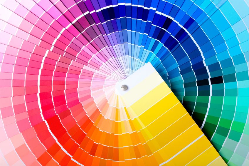
Have you ever noticed how simply stepping into a different room can shift your mood entirely? Maybe the soft tones in your bedroom help you wind down after a long day, while a bright, airy kitchen gives you the motivation to tackle your to-do list. This isn’t a coincidence—it’s the power of colour at work!
In interior design, colour psychology plays a major role in shaping the feel and function of a space. Understanding how different colours impact emotions can help you choose the right hues for every room in your home.
Let’s explore how you can use this knowledge to create intentional, mood-boosting environments that match your lifestyle.
What Is Color Psychology?
Colour psychology is the study of how different colours influence human behaviour, thoughts, and feelings. Each colour evokes specific emotional responses and can affect how comfortable, energized, relaxed, or focused we feel when applied to interior spaces. When planning a room’s design, considering its purpose and desired atmosphere can help you select a palette that supports how you want to feel in that space.
For example, your bedroom should encourage relaxation, while your home office might benefit from colours that enhance alertness and concentration.
Let’s take a closer look at how some of the most common colours are used in home design:
Black
Black makes a bold, dramatic statement. It exudes sophistication, power, and elegance. However, using too much black can make a space feel enclosed or overly intense, so it’s best used as an accent colour or in small doses to highlight key features in your space.
Gray
Gray is one of the most versatile colours in interior design. Light gray can feel soft and calming—ideal for bedrooms or living rooms—while darker shades can add depth and contrast. Just be sure to add pops of colour or texture to avoid making the space feel cold or flat.
White
Clean, crisp, and timeless, white is often used to create a sense of openness and light. It’s especially effective in smaller spaces, where it can make the room feel bigger and more breathable. White also pairs beautifully with nearly any colour, making it a great base for the layered design.
Brown
Brown brings a grounded, natural feel to a space. It reminds us of earth and wood, which is why it’s often associated with warmth, security, and stability. Using brown tones through natural wood furniture or décor elements can create a cozy and inviting environment.
Red
Red is a powerful, energetic colour. It stimulates the senses and is often associated with passion and excitement. Whether you’re using a deep burgundy for drama or a brighter red for vibrance, this colour works well in dining rooms, kitchens, or social spaces—but may be too stimulating for bedrooms.
Blue
Blue is one of the most popular colours in home design—and for a good reason. It’s known for its calming, relaxing effect and is great for spaces where you want to unwind, like bedrooms or bathrooms. Lighter shades promote peace, while navy and deeper blues add richness and sophistication.
Yellow
Warm and sunny, yellow is all about happiness and optimism. It’s perfect for brightening up kitchens, breakfast nooks, or entryways. While it can be overwhelming in large doses, it works beautifully as an accent colour that brings cheer and energy to your space.
Green
Green is a refreshing, balanced colour that symbolizes growth, renewal, and harmony. It works well in nearly any room—especially home offices, kids’ rooms, or living areas—where you want a sense of calm and creativity. Natural greens pair well with wood accents and neutral tones.
Making Colour Work in Your Home
Once you’ve selected a colour scheme based on how you want your space to feel, the next step is bringing that vision to life with the right furnishings and décor. Colour is a foundation, but your furniture completes the look and ties everything together.
Whether you’re leaning into calming neutrals, rich earth tones, or vibrant hues, having the right furniture to match or contrast your palette is key to creating a cohesive and inviting home.
If you’re looking for furniture that complements your ideal colour palette, visit the showroom at Conway Furniture in Listowel, Ontario, or browse our collections online. You’ll find various styles, colours, and high-quality pieces to suit every room in your home. Our friendly team is always happy to help you create a space that looks beautiful and feels just right!

Leave a Reply